Brand Style Guide & Logo for Sapien Designs
This was one of my first real-world projects! This past semester, I did an internship in graphic design for a small company called Sapien Designs. When I started my internship, the CEO asked me to create a brand style guide for the company. That project evolved into a proposed guide for a company rebrand. I was able to present this brand guide to the CEO. He plans to have senior designers in his company refine it and implement the new branding. For this post, I'll go a bit more into my process than the designs themselves.
When I began working at Sapien Designs, I found their branding to be very confusing. I started working on it but struggled so much with understanding the brand that it was several months before I could really start working on it. There are several color palettes, no clear rules or guidelines, etc. I also had not taken any classes in branding, so I had to learn as I went. Throughout the internship, I did several side projects until I felt I understood the brand enough to work on the guide.
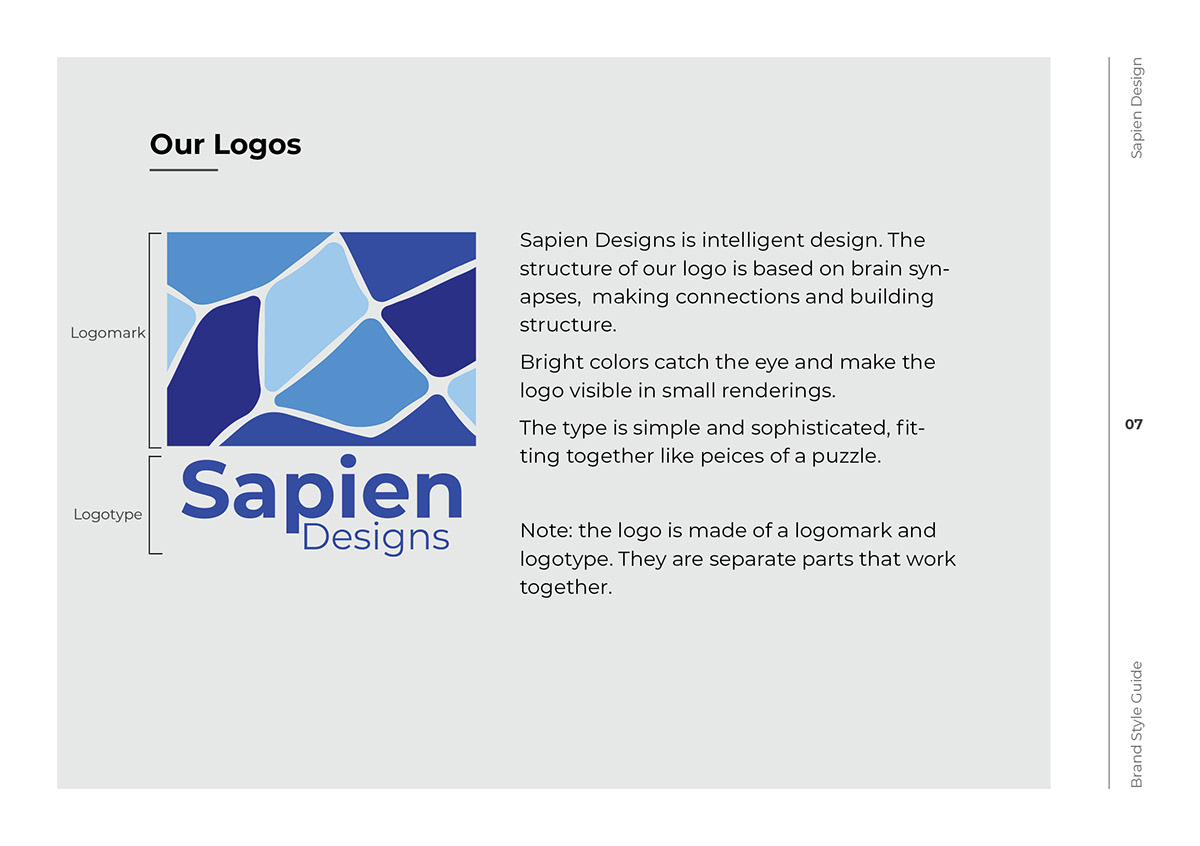
I had many conversations with the CEO of this small company and through process of time, it became apparent to me that his current branding was not only disorganized, it was outdated and not serving his company very well. When founding the company, the CEO had gotten a public domain logomark and added his own logo text to create his logo. This was a clear issue as it didn't serve the brand well and could be found in other places. We also had problems with the logo's visibility. Clearly, we needed to create a unique brand identity.
I got to work redesigning Sapien's logo. The CEO wanted a new logo that was based on the old one, so I began experimenting with it. At first the changes were small, then I added more and more until it became something really unique. It was a good opportunity to experiment, then bring my ideas to the CEO. In the end he had a large say in my final design.


After redesigning the logo, I took a closer look at the company's colors. As I mentioned, there were several color palettes in use. The colors in my redesigned logo also didn't pop like I (and the CEO) wanted them to. So, I created a new palette with bright, electric blues. The CEO loved it.

After redesigning the logo, I worked on the brand guide. I began with several pages explaining the company as a whole, then explaining what a brand system is, then getting into the details of Sapien's brand style. I included various elements: the logo, logo variations (and when/how to use them), brand type face, secondary typeface, photography and graphics guidelines, etc. It was a very basic brand guide but I felt it was a good start for Sapien to build on. I presented it to the CEO as a living document that could be refined and added to. My hope is that I have been able to bring clarity to Sapien's branding.
Here are some *select spreads from the brand guide I created. I create two documents; one designed for print and one for electronic use. This is the electronic version.